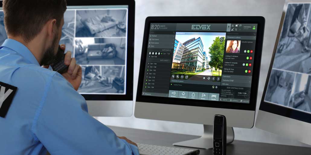
Legible and clear. Consistent icon design enhances usability of a complex software
The reception switchboard offers a wide range of functionalities:
- Coordination of all calls from the video door entry system
- Video answering service for internal and external calls
- Management of text messages with or without images
- Monitor of several surveillance cameras.
A consequently optimized icon design and a hierarchic color system were considered crucial in order to assure perfect usability of the software despite the high number of functions.
Icon system – Empowerment by stripping to the absolute essential
In order to obtain the best possible usability, the iconographic system was stripped to the absolute essential. Studying the perception pattern of potential users in detail, any redundant bit of information was eliminated from the user-interface.
The result of this consequent work of reduction was a perceptible empowerment of the interface.
- Client: Vimar / Elvox
- Client website
- Video Door Entry
- Brochure Door Entry (.pdf, 15MB)
- Other design projects for Vimar/Elvox
Main challenges
- Simplification of the user-interface
- Readability of icon system
Services provided
- Redesign of user interface
- Development of coherent icon system


 quickpartners.net
